
Using Google Forms on a Phone: What Actually Works
Yassine Jaa 11 minute read
You can build, publish and read a Google Form entirely from a phone. I did it on my iPhone on 15 September 2026, in Safari, with no app installed, and it took me sixteen minutes from an empty form to the responses open in a spreadsheet. That is the honest headline. The rest of this page is what those sixteen minutes actually looked like, screen by screen, because the gap between “it works” and “it is pleasant” is where most of the questions about Google Forms on mobile live.
If you came here for the one-line version: there is still no Google Forms app for iPhone or Android, the mobile web editor does far more than people assume, and the two things it does badly are worth knowing before you start typing on a train.
What I tested, and how
One phone, one afternoon. I opened forms.google.com in Safari at 15:25, built a small feedback form, changed its theme, published it, filled it in once from the link, checked the responses, and opened them in Sheets. My last Safari screenshot is stamped 15:41. Then I did the closest equivalent in our own app, starting at 15:48 and finishing at 15:54.
I am not going to pretend the two sessions are a fair benchmark. The second one used AI to write the questions, so of course it was faster. What the timestamps are good for is something else: they show where the minutes go on a phone, and it is not where I expected.
Creating a form in mobile Safari
The editor that loads on a phone is the real editor, not a cut-down one. You get the same purple header, the same three tabs (Questions, Responses, Settings) and a toolbar at the bottom of the screen with six icons: add a question, import questions, add a title, add an image, add a video, add a section.
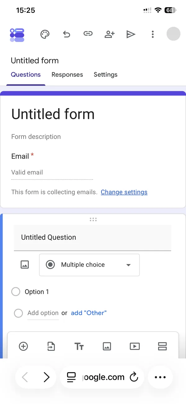
My first form had email collection switched on by default, which I did not ask for. On a desktop you notice the “This form is collecting emails” line immediately; on a phone it sits below the fold of the first card and I only saw it when I scrolled. If your respondents are anonymous, tap “Change settings” and turn it off before you share anything.
Adding questions works the way you would hope. Tap the plus icon, type the question, pick a type. The type picker is a dropdown that opens as a tall list over the page, and it is complete: short answer, paragraph, multiple choice, checkboxes, dropdown, file upload, linear scale, rating, multiple choice grid, checkbox grid, date and time. Twelve types, including the rating stars that some guides still say are desktop-only.
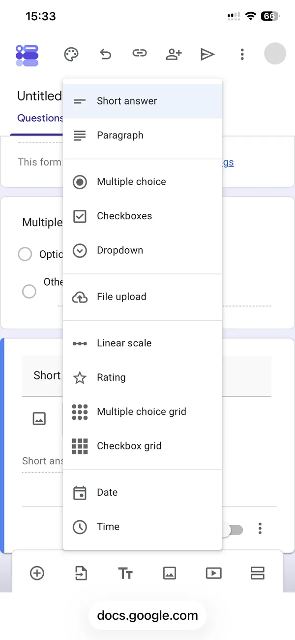
Here is where the first minutes went. My first screenshot is 15:25. The screenshot with my second question in place is 15:32. Seven minutes for two questions is slow, and the reason is not the editor, it is the keyboard. Every time you tap into a field, the keyboard takes the bottom half of the screen, the toolbar disappears behind it, and the card you are editing may or may not scroll into view. I spent more time dismissing the keyboard to reach the toolbar than I spent writing.
There is a second, smaller thing. When you tap outside a question card, Google Forms deselects it and collapses the editing controls. On a desktop that is a mouse movement. On a phone it is easy to do by accident while scrolling, and then you tap the card again to get the controls back. Not a bug, just friction.
Theme and appearance
I expected the theme panel to be missing on mobile. It is not. Tap the palette icon in the top bar and a side panel opens with text style for header, question and body (font and size for each), a header image button, and a colour grid.
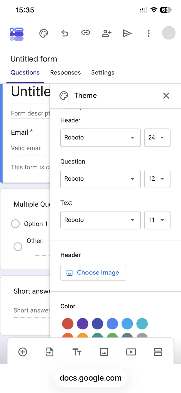
The Theme panel on a phone
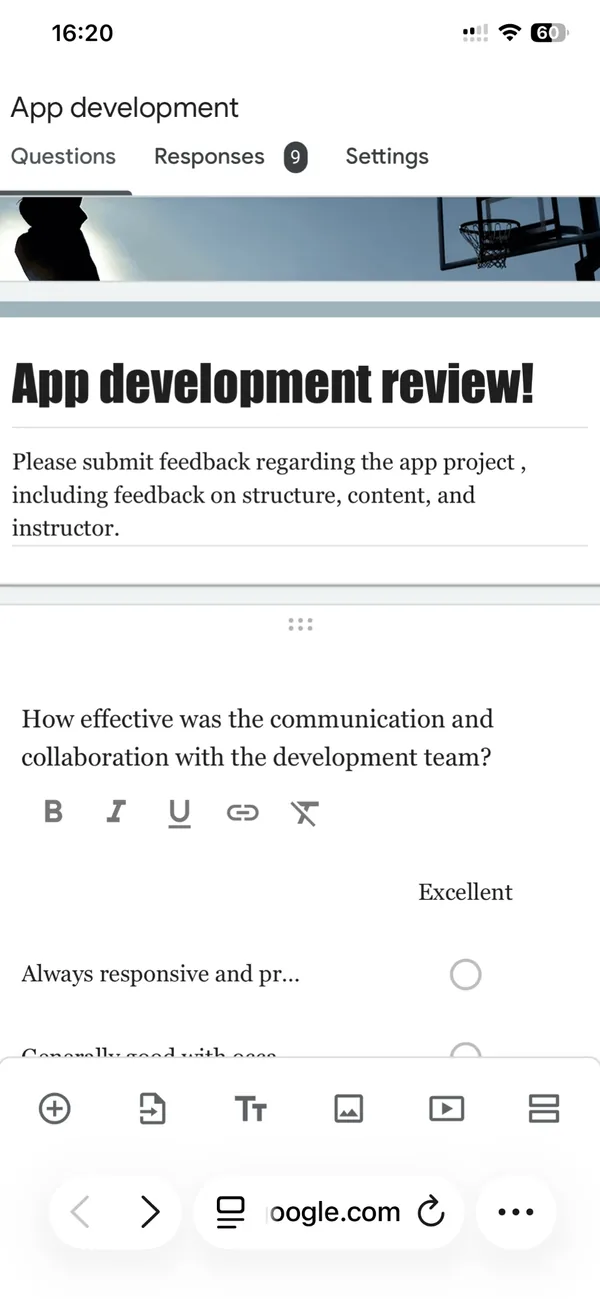
What it produces: a themed form, still in Safari
The second screen above is one of my older forms, with a display font for the title, a serif for the questions and a photo in the header, all set from the phone. So the panel is not decorative; it does the job.
The header image is the part I would still do on a computer. Choosing an image on a phone works, but Google crops it to its 4:1 header shape and you have no real control over the crop on a small screen. If the header matters (a logo, a photo with a face), build it at the right size first. We made a small tool for exactly that: the Google Forms header image maker exports the 1600 by 400 pixel image Google wants, so the crop step has nothing left to cut.
Publishing and sharing from a phone
This is the part that changed in the last year and where older tutorials will mislead you. There is no “Send” button any more. The paper-plane icon opens a dialog called “Published options”, with an “Accepting responses” toggle, a “Responders” row set to “Anyone with the link” by default, and, marked as new, a link to set a close date or a response limit.
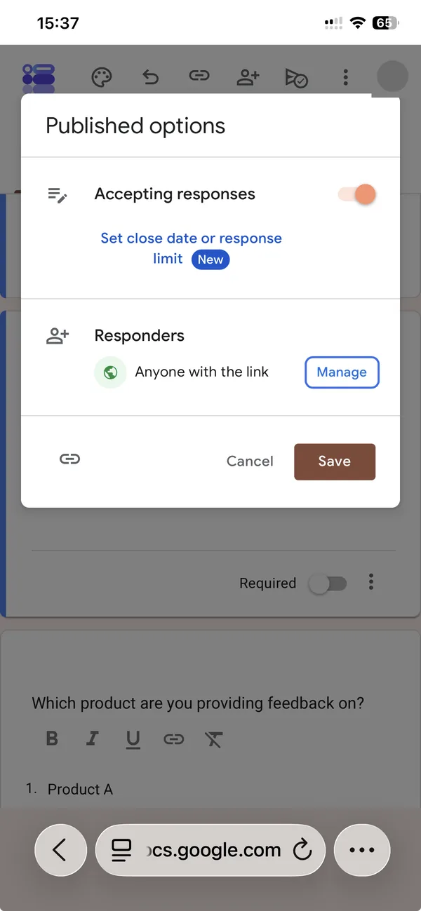
Two things to take from that screen. First, the response limit is native now. For years the only way to cap a form at, say, 50 sign-ups was an add-on or an Apps Script, and neither of those runs on a phone. Now it is a link in the publish dialog. Second, the only way to get the form URL is the small link icon in the bottom-left corner of that dialog. There is no button labelled “Copy link”, and the icon is easy to miss below the Cancel and Save buttons.
What the dialog does not have is a QR code. Google Forms has never offered one, on any platform. If you are putting the form on a poster, a slide or a table at an event, you will need to make the code somewhere else. Our QR code generator runs in the browser, on the phone if you like, and never sends your form link anywhere.
Reading responses on a phone
The Responses tab works and shows a count in the tab itself. Summary, Question and Individual views are all there, and the charts render. My test form already had nine responses from earlier tests, and the summary was readable on the phone without pinching, which made checking who had answered a thirty-second job.
The Sheets link is where a phone stops being one device. Tapping the green Sheets icon does not open a spreadsheet in Safari. On my phone, which has the Sheets app installed, it handed me straight over to that app. You end up reading responses in one app and editing the form in another, with Safari’s “back” link in the status bar as the only thread between them.
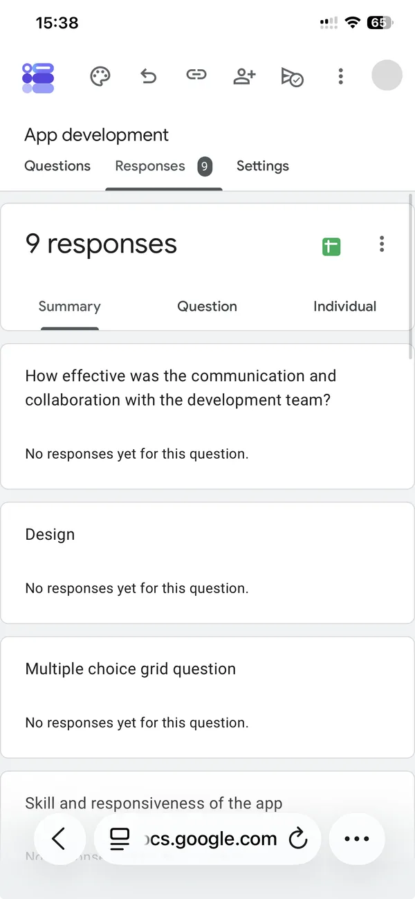
Responses in Safari
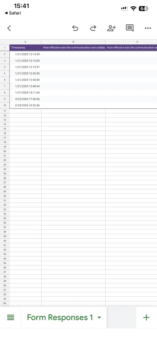
The same nine rows in the Sheets app, one tap and one app later
For a quick look at who answered, the Responses tab is enough. For anything you would actually do with the data (sorting, filtering, sharing a subset), you are in Sheets on a phone, which is its own subject and not a comfortable one.
What I would not do on a phone
Three things, from this session and from the ones before it.
I would not write a long form on a phone. Four to six questions is fine. Twenty questions with section logic is an hour of keyboard fighting, and the “Go to section based on answer” menus are hard to read at phone width. Write the questions in Notes first if you must, then paste them in, or build the skeleton on a computer and use the phone for edits.
I would not set up file upload questions from a phone. They work, but the permissions dialog about Drive storage is easy to dismiss without reading, and the storage owner question matters if the form is on a shared account.
I would not review responses in the Sheets app on a phone for anything beyond a glance. Export instead, and read it on a bigger screen.
Where an app changes the arithmetic
The same afternoon, I built the same kind of form in our app. Six minutes, 15:48 to 15:54, and I spent none of them typing questions, because I typed “Product satisfaction survey”, set the count to seven and let the app write the questions into a real Google Form in my Drive.
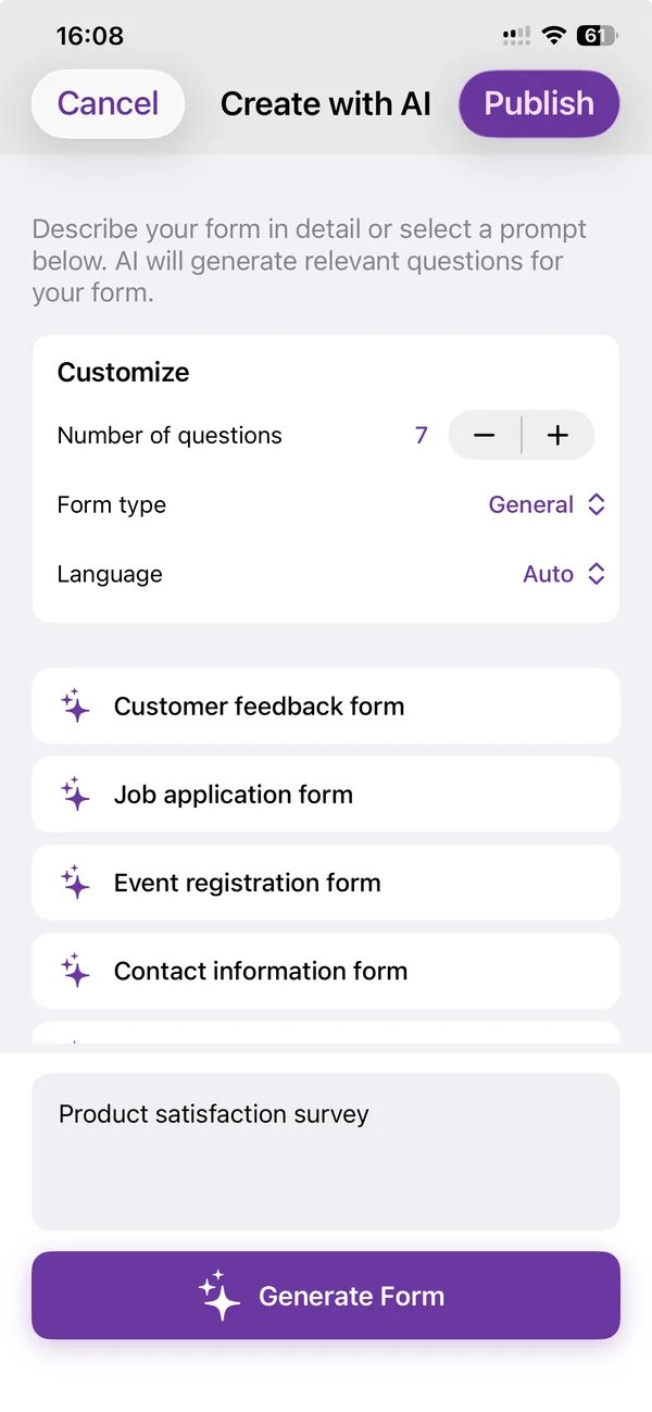
The prompt: five words and a question count
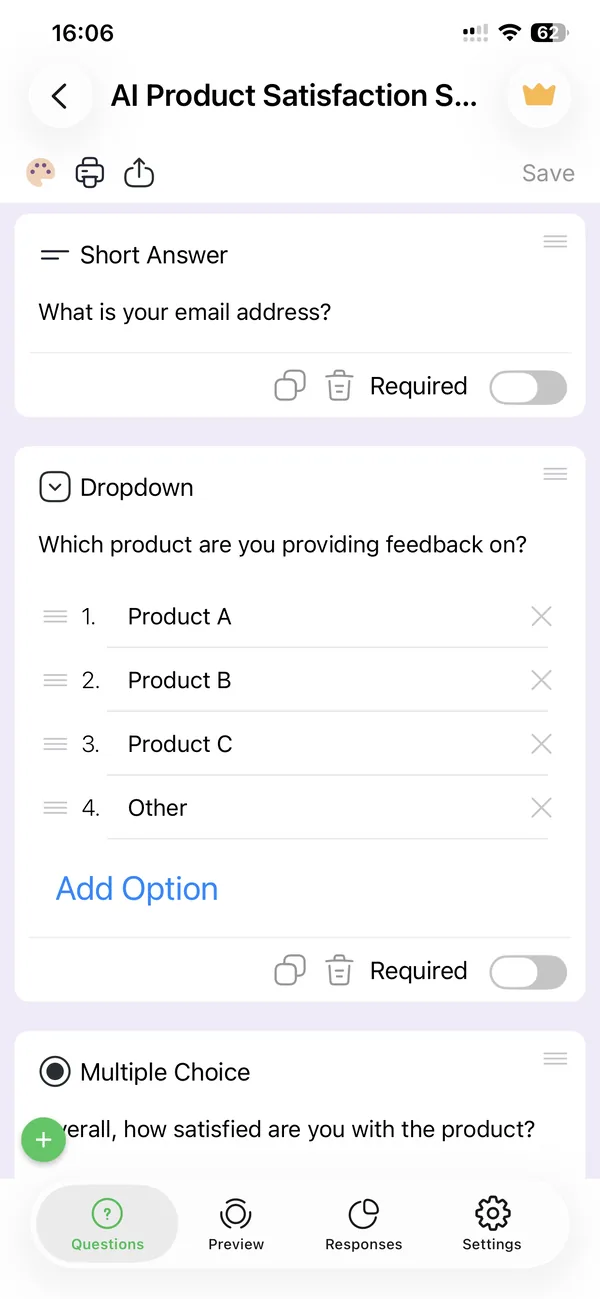
The result, a minute later, editable in the app or in Safari
I want to be careful here, because this is our product and the page would be worthless if it read like an advert. The app does not replace the Google Forms editor. It writes into the same forms, in your own Google Drive, and the form you get is a normal Google Form that you can open in Safari afterwards and edit exactly as described above.
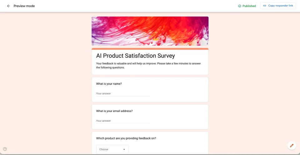
What it removes is the keyboard problem: you describe the form instead of typing each question, and the share screen has the QR code built in.
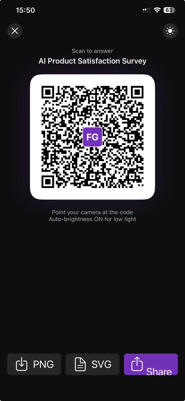
The QR code Google Forms does not have, one tap after publishing
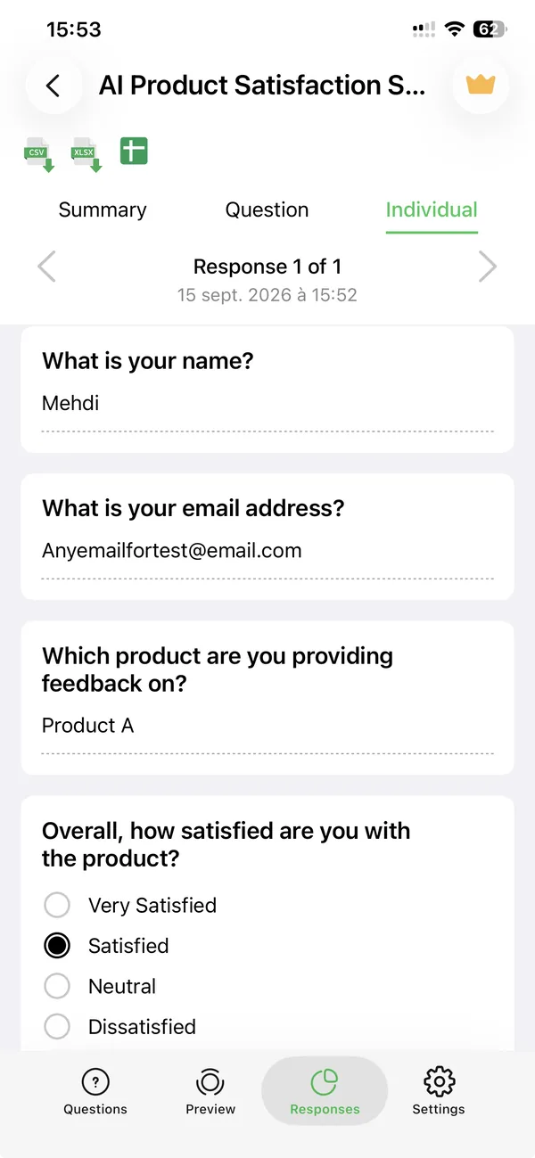
Responses, with CSV, XLSX and Sheets export from the same screen
The responses screen is the other place it helps on a phone: the CSV and XLSX buttons produce a file you can send yourself or drop in Files, without the hand-off to the Sheets app. If that is the whole reason you are reading this, the app page explains what is free (creating and sharing forms is) and what is not.
If it is not, then the honest advice is the one I started with. Safari on a phone is a real Google Forms editor. Keep the forms short, turn off email collection unless you need it, copy the link from the small icon in the publish dialog, and make your QR code somewhere else.
Related reading
If you want the steps rather than the story, How to create a Google Form on iPhone is the same session cut into seven numbered steps, one screenshot each.
The question this page keeps getting asked in a different form is answered in Is there a Google Forms app for iPhone? (no, and what to use instead). If you already have a form and want to get more out of it, six Google Forms features you are probably not using covers response validation, sections and the settings most people never open.
Build the form on the device you already have
Keep reading
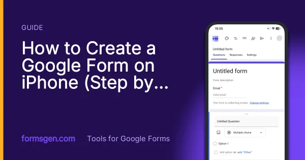
How to Create a Google Form on iPhone (Step by Step)
Seven steps in Safari, each with a screenshot from an iPhone: open a blank form, add questions, set the theme, publish, copy the link, test it, read the responses.
Is There a Google Forms App for iPhone?
No, Google does not publish one. What works instead on an iPhone, compared honestly, including when the browser is the better answer.

Six Google Forms Settings Most People Never Switch On
Six settings that are already in Google Forms and rarely switched on, with the menu paths checked against Google’s documentation — and the one that will cost you responses.